Introducing The New SB Nation St. Louis Logo
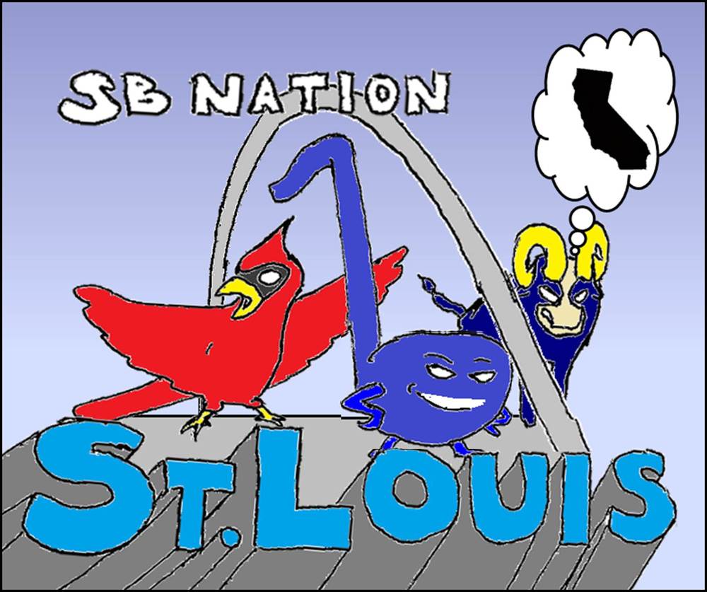
Actually, not really – but if it could be it’d be fantastic. Earl Sleek, the cartoonist for SB Nation’s California hockey blog Battle of California, has been taking requests from the rest of the SBN hockey blog managers. I wondered aloud what a logo for here’d look like, since there was so much opportunity for the incorporation of either alcohol or just generally sad looking people in Cardinals jerseys, but what Earl did was so much better…
![]()
I love the general sassiness (I guess you could say) of the Blue Note, looking up at the attention-hog Cardinal obviously trying to argue that Albert was safe on another double play ball. Also, the Ram in the background, trying to look intimidating but kind of not coming off that way is also brilliant. Sleek (as well as San Jose Sharks bloggers The Couch Tarts) always offer some great takes on sports. Part one of his series can be found here, and part two, here.
Also, there’s an alternate version of our blog logo that may or may not be more accurate:
![]()